


Market and Sector Check
Here comes July - Bullish for Investors

WELP…what a difference one week makes! Lots to get through for the week ahead.
NOTE: This is a short week (Thursday will be a shortened trading day and Friday will be off for July 4th). I do have a few new picks that I want to monitor to add, and will share more on substack chat.
U.S. markets closed June with a dramatic geopolitical sigh of relief and renewed bullish momentum, as a U.S.-brokered ceasefire between Iran and Israel cooled oil prices after a 15% mid-month spike and lifted the S&P 500 and Nasdaq to record highs…capping a 4.4% monthly gain for the broad index.
The Fed held rates steady at 4.25%-4.50% but spotlighted stagflation risks in updated projections: officials now see 2025 inflation at 3% (up from 2.7%) and unemployment rising to 4.5%, even as Powell’s congressional testimony emphasized “solid” economic growth amid “somewhat elevated” price pressures.
With the ceasefire holding tentatively and July’s historical tailwinds kicking in, the upcoming month boasts the S&P 500’s strongest average gain (1.7%) since 1928 and has lifted the Nasdaq for 16 straight years. Investors enter Q3 eyeing oil’s retreat below $77, Powell’s evolving rate-cut signals (July odds now at 22.7%), and a $7 trillion cash pile waiting to flood equities.

After a sharp correction in February through early April driven largely by renewed tariff concerns, all major indexes shown have not only recovered but now sit at or near positive territory year-to-date as of late June 2025. The ARK Innovation ETF (cyan line) showed the most volatility, plunging nearly 28% at its lowest point but now leads with a 24% gain, reflecting a strong rebound in high-growth, speculative tech. The Nasdaq (red), NYSE (blue), DJIA (green), and S&P 500 (magenta) have all clawed back losses, now modestly positive between 2% to 5%, while the Russell 2000 (black) remains slightly negative, suggesting small-cap stocks are lagging. The V-shaped recovery across the board highlights strong bullish momentum and investor confidence returning (for now) after tariff worries subsided.

The latest Relative Rotation Graph (RRG) highlights sector performance versus the S&P 500 (SPY) in terms of relative strength and momentum. Technology (XLK) and Industrials (XLI) are firmly in the "Leading" quadrant, with strong RS-Ratio and improving momentum, suggesting continued leadership and bullish relative strength. Financials (XLF), Utilities (XLU), and Consumer Staples (XLP) are in the "Weakening" quadrant, showing signs of losing momentum even if they still outperform slightly. Communication Services (XLC) and Materials (XLB) are near the center, indicating potential rotation either way. Meanwhile, Energy (XLE) and Health Care (XLV) are deep in the "Lagging" quadrant with weak momentum and relative strength, while Consumer Discretionary (XLY) is rotating into "Improving," hinting at a possible comeback.
For traders looking to ride strength, XLK and XLI are the top picks, especially with XLK posting a strong +10.75% year-to-date gain. XLY is worth watching for early entry if its momentum continues rising. Avoid or stay cautious on XLV and XLE until signs of reversal appear.
Relative strength check
Let’s take a look at a few relative strength charts.
Russell 1000 Growth vs. Value (IWF:IWD)

The Russell 1000 Growth vs. Value ratio (IWF:IWD) has clearly turned bullish after bottoming in April, confirming renewed leadership from growth stocks. The recent “headfake” did not break trend, and the ratio continues to climb, favoring risk-on sectors. Technology (XLK) and Consumer Discretionary (XLY) are leading with strong relative strength, while Industrials (XLI) and Financials (XLF) follow with moderate momentum. This setup supports a growth-over-value positioning, with Tech and Discretionary offering the best upside for now.
Growth vs. Value (VUG:VTV)
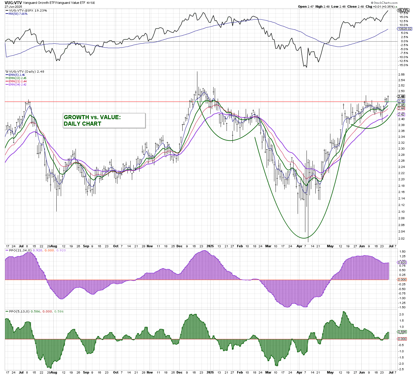
The daily chart of Growth vs. Value (VUG/VTV) shows a clear bullish trend favoring growth stocks. After forming a textbook cup-and-handle pattern from March through June, the ratio has broken above key moving averages and horizontal resistance near 2.46, signaling renewed strength. Momentum indicators (PPO and histogram) support this move, staying firmly in positive territory. With price holding above rising EMAs and no sign of reversal, growth remains in control, reinforcing overweight positions in sectors like Tech and Consumer Discretionary while underweighting value-focused areas.
Consumer Discretionary vs. Consumer Staples (XLY:XLP)

The XLY:XLP ratio (Discretionary vs. Staples) mirrors the bullish setup seen in VUG/VTV, signaling strong risk appetite. After a deep pullback earlier in the year, the ratio formed a rounded base and has now broken out above horizontal resistance. Price is trading above all major EMAs with solid upward momentum, supported by a rising PPO and positive histogram. This confirms leadership from consumer discretionary stocks over defensive staples - another clear sign that the market favors growth and offense over safety.
Gold vs. Growth (GLD:VUG)

Similarly, the chart of GLD:VUG (Gold vs. Growth) shows a clear breakdown in favor of growth stocks, signaling a "risk-on" environment. After a sharp surge in gold relative to growth in early 2025, the ratio has reversed hard, failing to hold above its long-term moving averages. The recent rejection and drop below the 50-day and 10-day averages confirm that gold is underperforming. This shift indicates reduced demand for defensive assets like gold and growing confidence in risk assets, reinforcing broader bullish signals already seen across other growth and breadth metrics.
Semiconductors vs. S&P 500 (SMH:SPY)
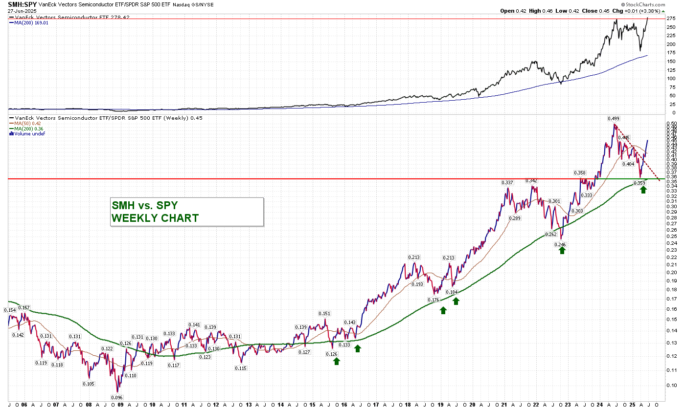
The weekly SMH:SPY chart also shows semiconductors regaining strength after a healthy pullback. The ratio bounced cleanly off its rising 50-week moving average and broke above a short-term downtrend, signaling renewed relative outperformance versus the broader market. With a strong historical uptrend intact, this looks like a bullish resumption. For traders, this suggests it's time to revisit leveraged semiconductor plays like SOXL, especially if momentum continues and SMH pushes toward retesting its relative highs.
Internal Market Indicators
NYSE Advance-Decline Line (NYAD)

The NYSE Advance-Decline Line (NYAD) tracks the cumulative number of advancing stocks minus declining stocks on the NYSE, offering a broad measure of market participation. When NYAD rises, it means more stocks are gaining than losing, which typically confirms the strength of a rally. Conversely, if indexes rise but NYAD falls, it may signal weak breadth and potential risk under the surface.
In this chart, NYAD is in a strong uptrend, making new highs and staying well above all moving averages. The ribbon of EMAs is fanned out and rising, confirming broad participation in the rally. The MACD at the bottom also shows positive momentum, supporting sustained strength. This is a healthy market backdrop - internals are strong, breadth is expanding, and the bull move is well-supported by wide sector and stock participation.
New Highs minus New Lows (NYHL)

The NYHL (New Highs minus New Lows) indicator tracks the net number of stocks making new 52-week highs versus those making new lows on the NYSE. It's a breadth measure that shows whether leadership is expanding (more highs than lows) or deteriorating (more lows than highs). Sustained positive readings indicate market strength and broad participation.
In this chart, NYHL clearly warned of weakness in March through April as the red line flattened and rolled over, preceding a selloff. However, since early May, the indicator bottomed and surged sharply higher, with the green line accelerating, signaling a strong bullish reversal. This strength is echoed across all major indexes shown below (Nasdaq, Russell 2000, ARK, and Semiconductors), which have all broken their prior downtrends. The broad move higher in both price and internals confirms that the bull market is not only intact but strengthening with wide participation - for now :).
Looking at the folio + picks
For all those interested - I’ve shared some insight on AFRM and SOFI - take a look at the article below. This could be an interesting play.
📈 SOFI & AFRM: Setting Up Like Another MAJOR STOCK Before Its Breakout?

If you've been tracking names like SoFi (SOFI) and Affirm (AFRM), you're likely noticing something interesting. Their monthly charts are starting to look eerily similar to another large-cap stock right before it exploded out of a long base in early 2024.
Now let’s take a quick look at the set of picks we have been grabbing for trades and longer term.

Keep reading with a 7-day free trial
Subscribe to Trading Thoughts with LCC007 to keep reading this post and get 7 days of free access to the full post archives.